Ranking MLB's new City Connects: Some elite entries join fold
Another MLB season brings with it another batch of City Connect uniforms - and another round of rankings. Here's how we're feeling about the newest looks being worn around the league.
9. San Francisco Giants
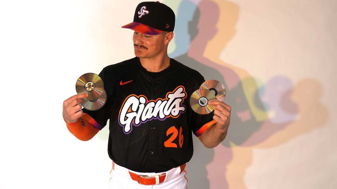
These cartoonish oddities look like an alternate uniform you'd unlock while opening packs in MLB The Show. Quick-sell for stubs.
8. Colorado Rockies
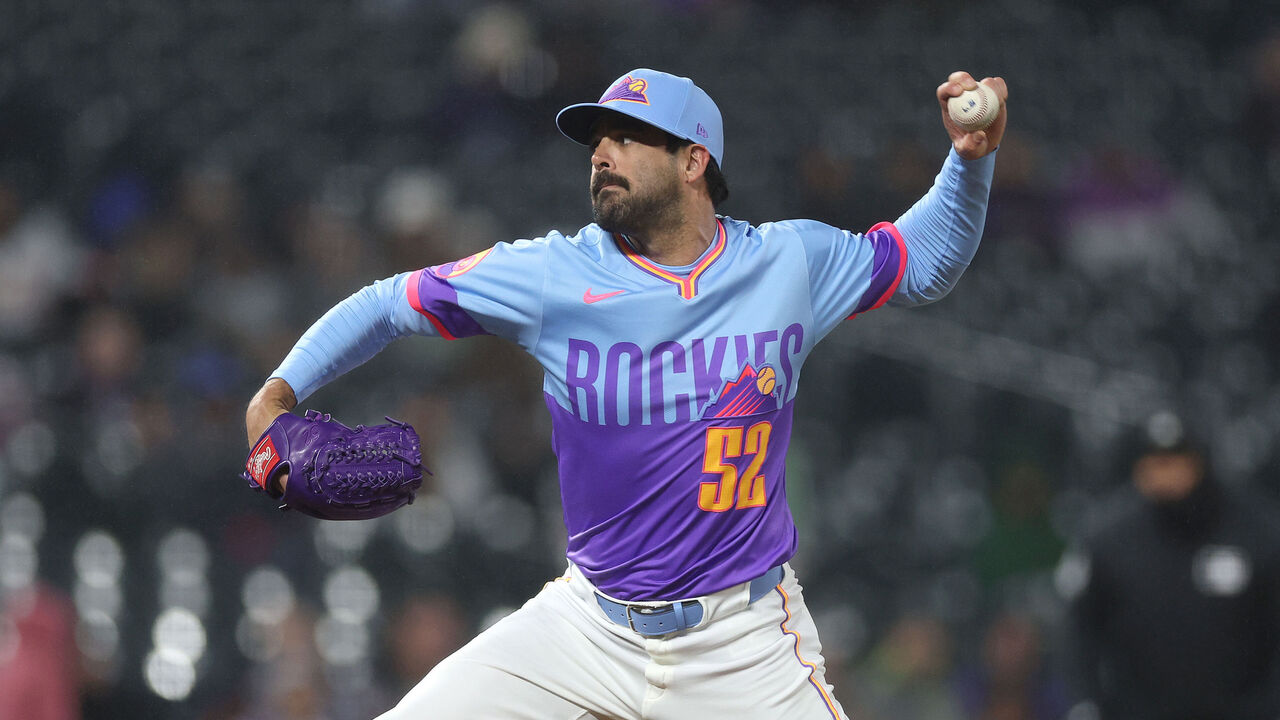
The Rockies have donned many great uniforms in their history - this explosion of clashing colors is not one of them.
7. Washington Nationals
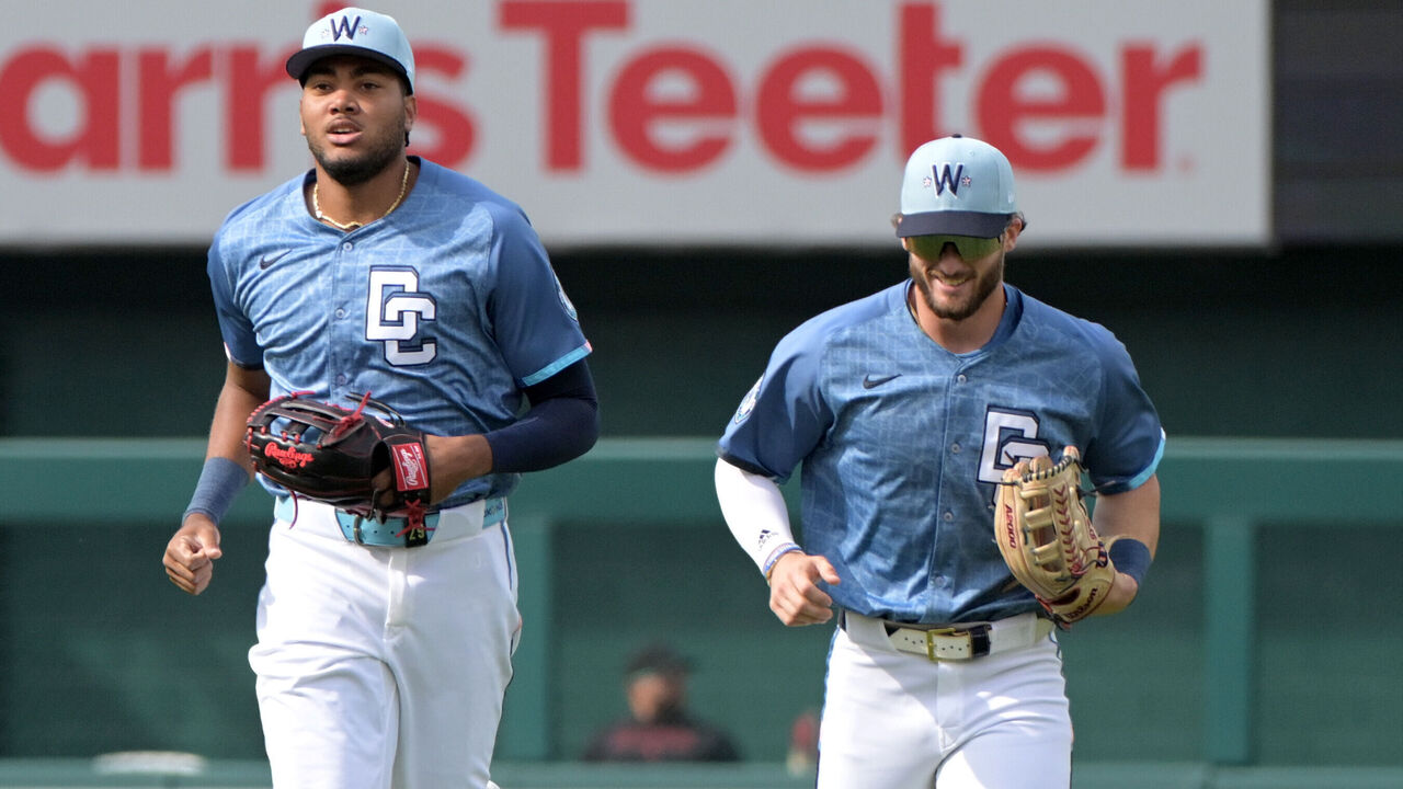
They ditched the cherry blossoms for this? The city grid detailing is interesting upon close inspection but makes the jerseys look dirty from afar. At least the logo on the hat won't be mistaken for Walgreens.
6. Chicago Cubs
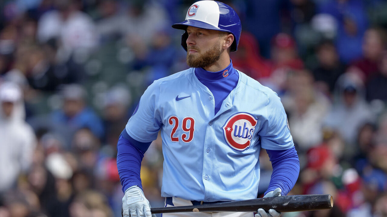
These aren't technically a City Connect, but we're including them anyway. They're sharp albeit not very exciting. It feels like the Cubs have already had several uniforms that look like this.
5. Miami Marlins
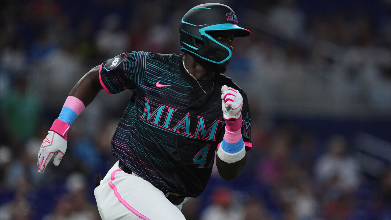
The jerseys give off glow-in-the-dark bowling alley vibes, which means they capture the intended retro look in all the right ways. If only the 305 area code on the helmets and hats didn't look like it says "SOS."
4. Houston Astros
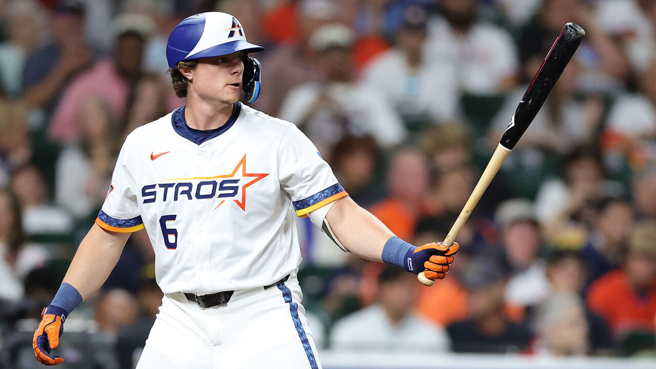
These are a significant improvement on Houston's last City Connect uniform. Having them say "Stros" over "Astros" feels like a misstep, though.
3. Arizona Diamondbacks
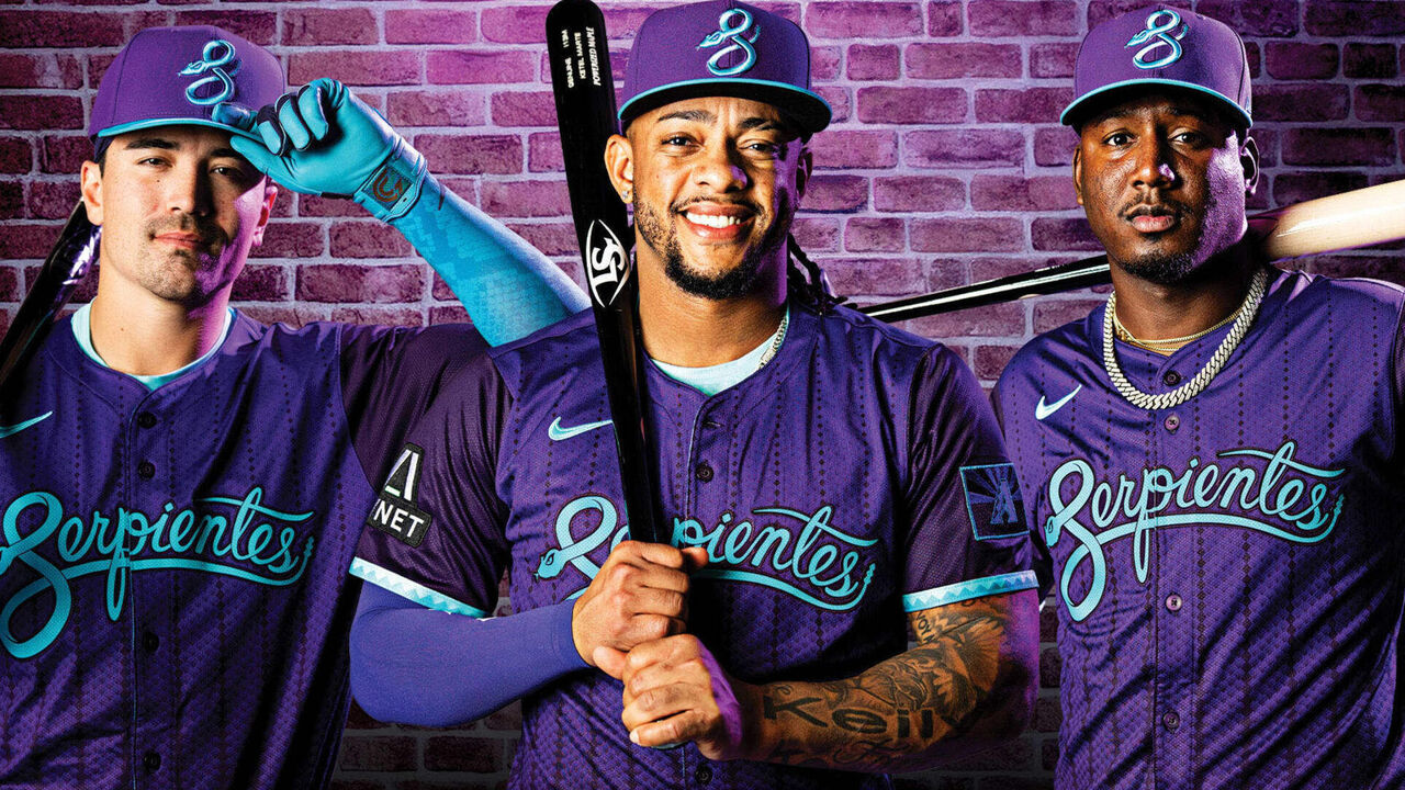
Purple is back in Arizona, and it never should have left. These merge their previous City Connect with old-school D-Backs vibes. If only they'd truly committed to the throwback and gone sleeveless.
2. Boston Red Sox
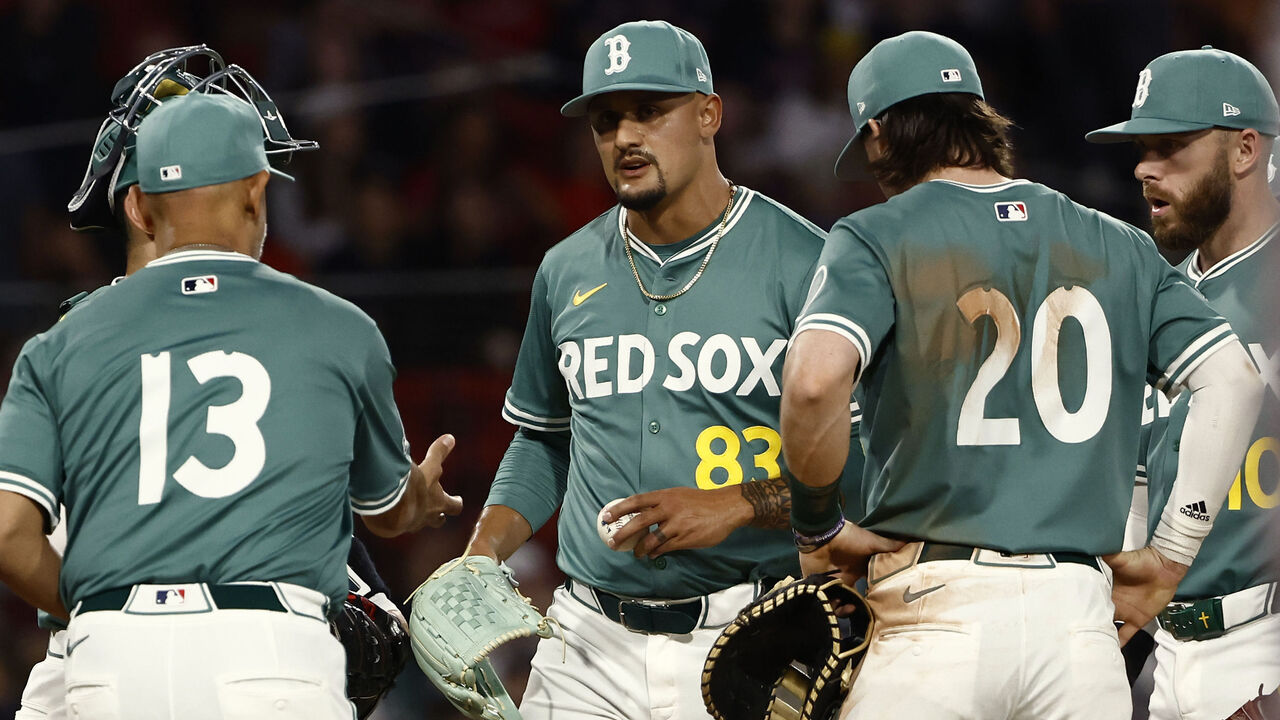
From the font to the color scheme, these uniforms channel Fenway Park's iconic Green Monster in all the right ways.
1. Chicago White Sox
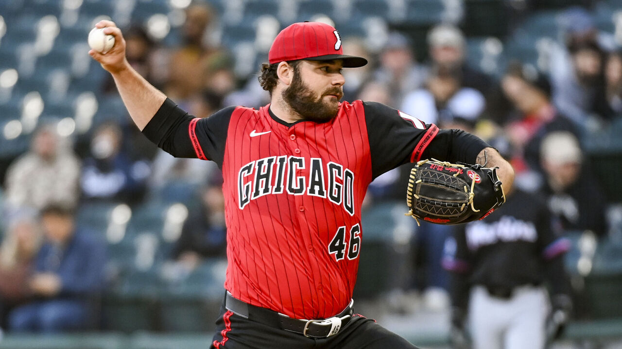
These are as cool as it gets. Everything pops, and collaborating with the Bulls, Chicago's most iconic sports franchise, was an excellent idea. The White Sox are 2-for-2 when it comes to City Connect uniforms.