Ranking the NHL's 100 Greatest Logos: Nos. 60-41
Throughout the month of September, James Bisson and a cast of editors from theScore will share their rankings of the greatest players, teams, and moments in the 100-year history of the National Hockey League. This week's list focuses on the greatest team logos (active team logos courtesy NHL; defunct team logos courtesy SportsLogos.net):
100-81 | 80-61 | 60-41 | 40-21 | 20-1
Voter List
- James Bisson, National Sports Editor
- Josh Wegman, NHL News Editor
- Sean O'Leary, NHL News Editor
- Esten McLaren, NHL News Editor
- Lucas Casaletto, News Editor
- Michael Amato, Senior News Editor
- Craig Hagerman, NHL News Editor
- Lanny Foster, Senior Social Media Editor
- Arun Srinivasan, News Editor
60. Chicago Black Hawks (1926-1935)
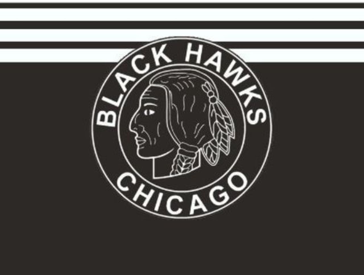
While the original Black Hawks logo itself isn't that far removed from the current iteration, this one is quite a bit … less colorful. The addition of white horizontal lines from 1927-1934 didn't exactly jazz it up, either.
59. Boston Bruins (1924-26)
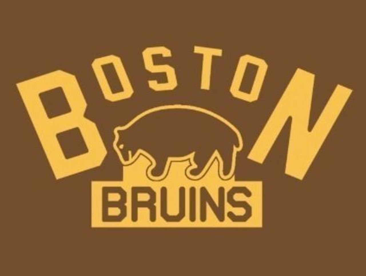
The difference between the Bruins' original logo and the updated one we rated lower? It's all in the upper lettering; this version is cleaner than the later one, which features an inexplicably clunky font.
58. Chicago Black Hawks (1959-1990)
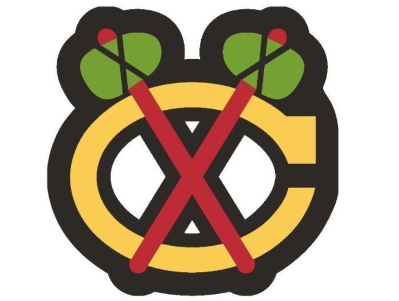
Of all the various versions of the Black Hawks' secondary logo, this one - with red and green tomahawks and a yellow C - easily lasted the longest. It can be argued that it's also the nicest looking of the bunch.
57. Carolina Hurricanes (1999-present)
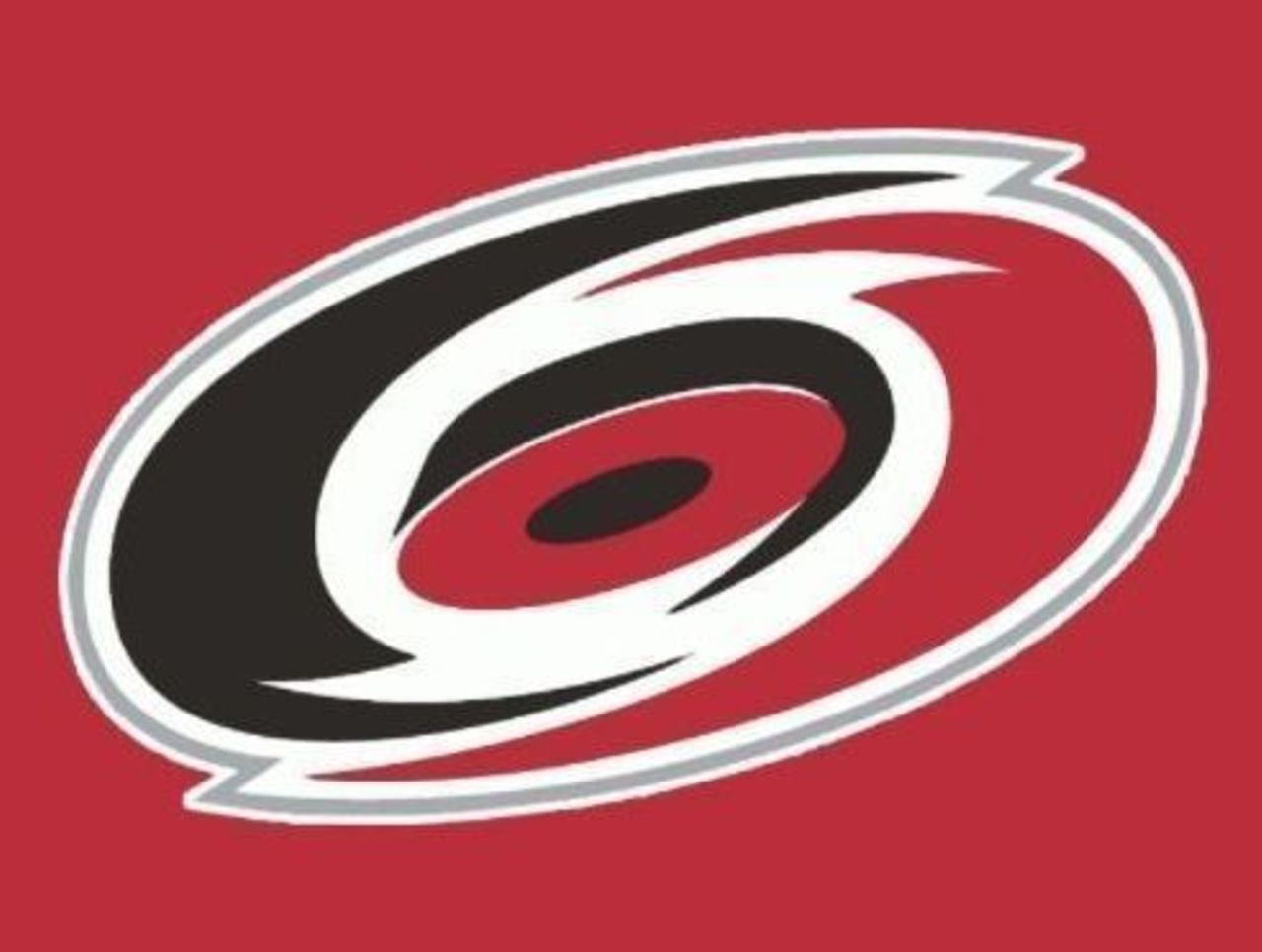
There's nothing complicated about this one; the Hurricanes' primary logo is quite clearly a hurricane. This version, in which the eye of the storm is a darker shade of red, was introduced in the team's third season.
56. Minnesota Wild (2004-present)
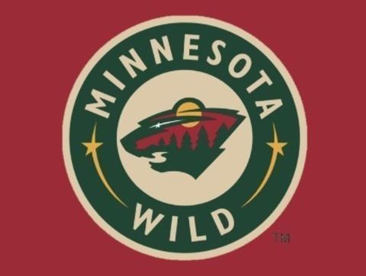
Forgive us if we aren't Wild (pun intended) over the decision to take one of the coolest NHL post-expansion logos and make it the centerpiece of yet another hum-drum circle configuration. That said, it still looks good.
55. New York Rangers (1996-2007)
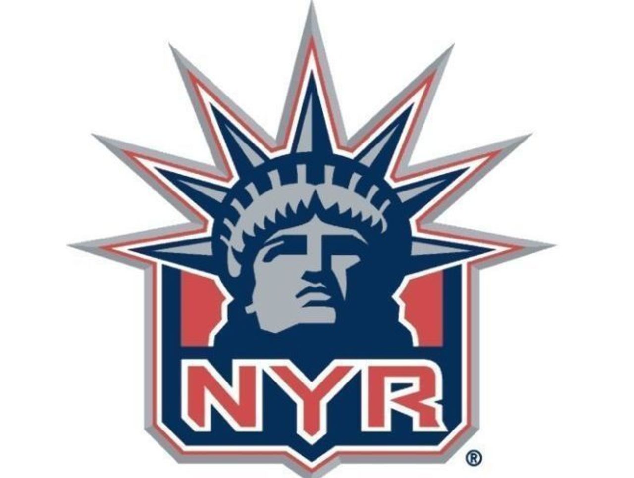
Any time an Original Six team makes a drastic change to its primary logo, there's a bit of an uproar. But it's hard to argue with the Rangers going with one of the city's most iconic symbols as the focal point of a great design.
54. Cleveland Barons (1976-78)
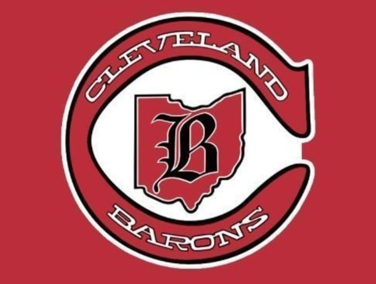
If the NHL ever decides to venture back to Cleveland, that franchise could do a lot worse than going with the Barons' eye-catching logo. Putting the great state of Ohio in the middle is a nice touch.
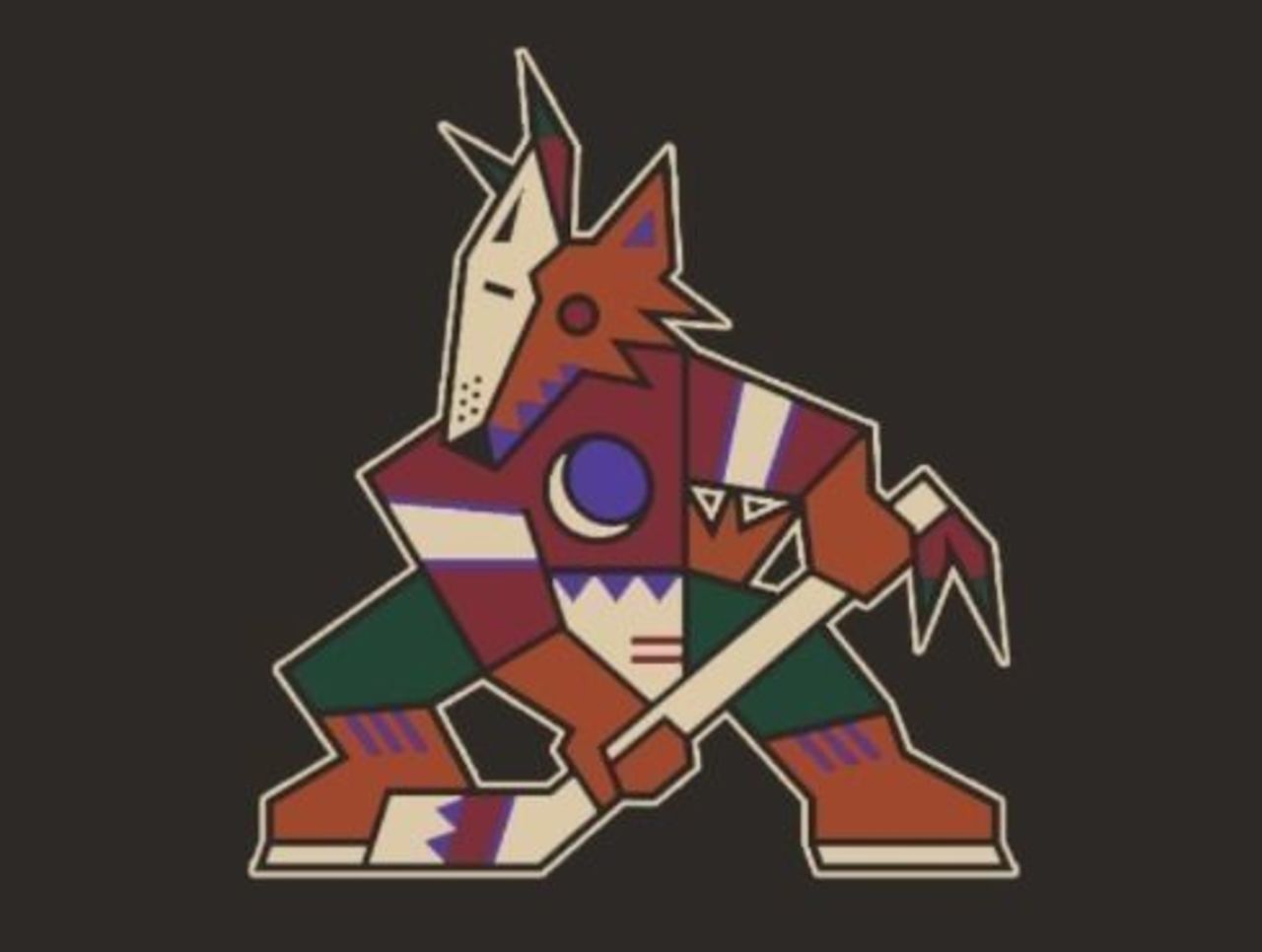
53. Phoenix Coyotes (2003-14)
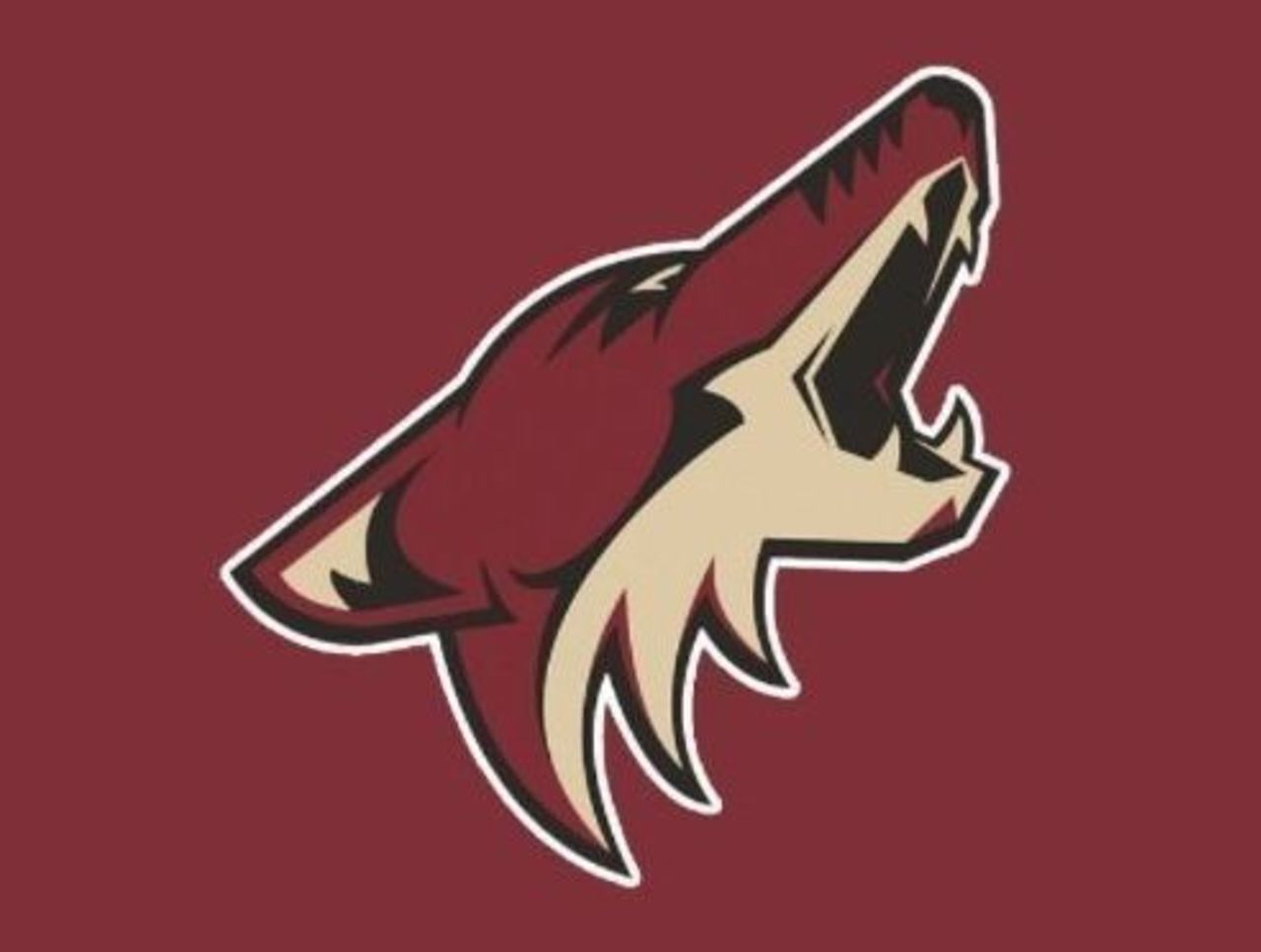
The Coyotes abandoned their multi-colored coyote logo in the early 2000s in favor of a simple howling face. While it lacks the panache of its predecessor, the brick red and sand color combination is one of the best around.
52. Winnipeg Jets (1990-96)
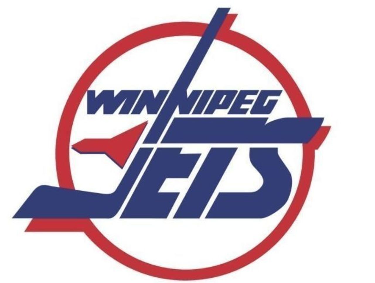
This is an example of a team replacing an iconic logo with one that is only slightly less appealing. The color combination really jumps off the jersey, and the lettering is quite similar to that of the original.
51. Montreal Canadiens (1999-present)
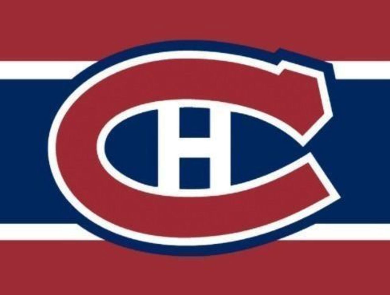
The iconic CH has gone through a number of cosmetic changes, but this version - with that strip of dark blue running through the middle - has been the standard bearer since the turn of the century.
50. Phoenix Coyotes (1996-2003)
The arrival of NHL hockey in the desert resulted to this incredibly polarizing logo, which was unlike anything the league had ever seen before. Whether you love it or hate it, it certainly makes you feel something.
49. Detroit Red Wings (2009 Winter Classic)
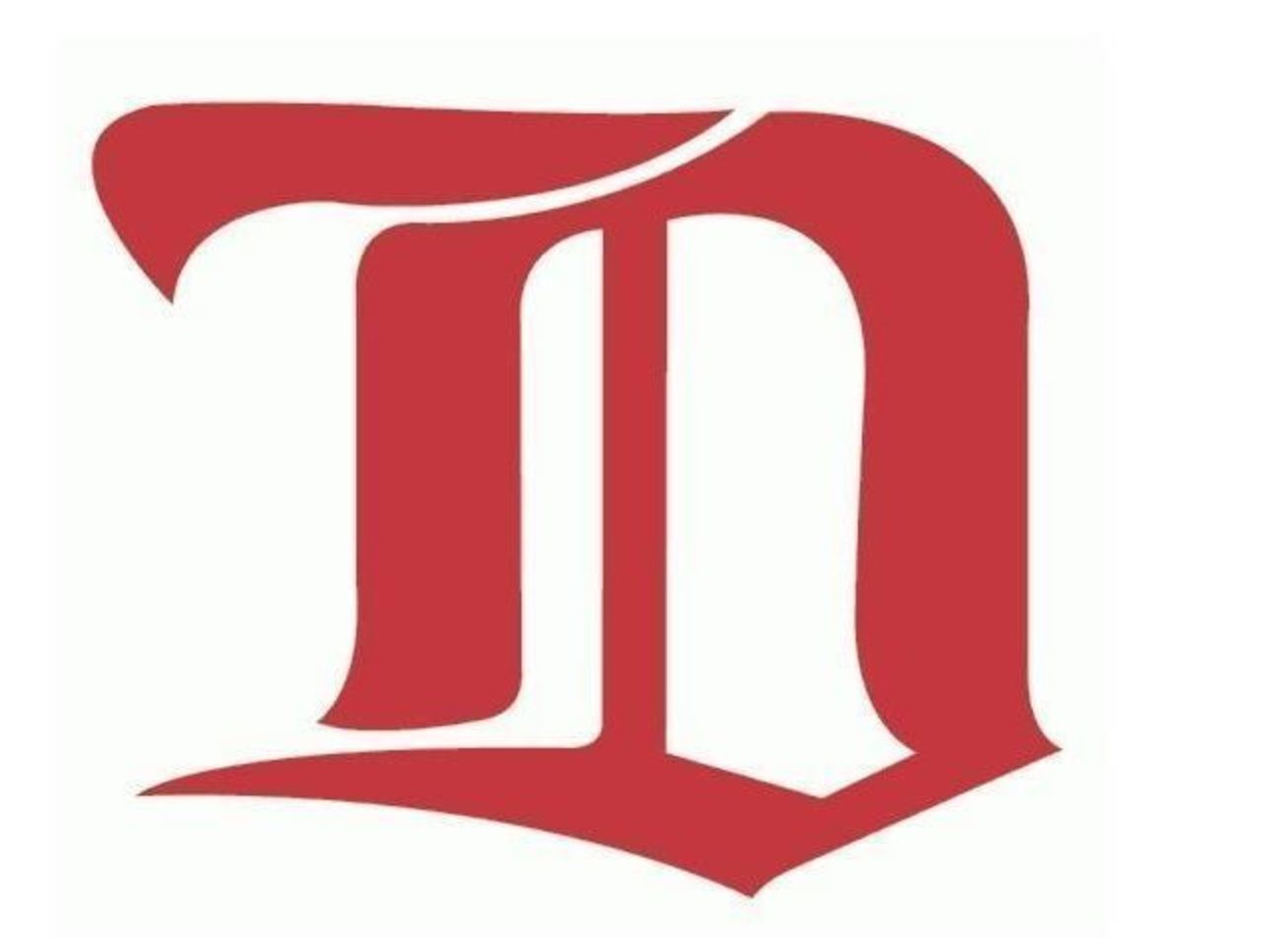
You won't find many one-time-only logos on this list - but the Red Wings' script D is just too good to leave off. In fact, we wouldn't mind seeing the Wings bring it back at some point in the future.
48. St. Louis Eagles (1934-35)
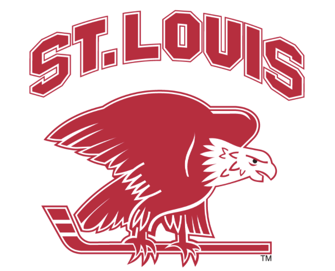
Yet another short-lived NHL tenure provided one of the cooler logos not presently in use. There's just something about the combination of birds and hockey sticks that makes us go wild.
47. Los Angeles Kings (1969-1988)
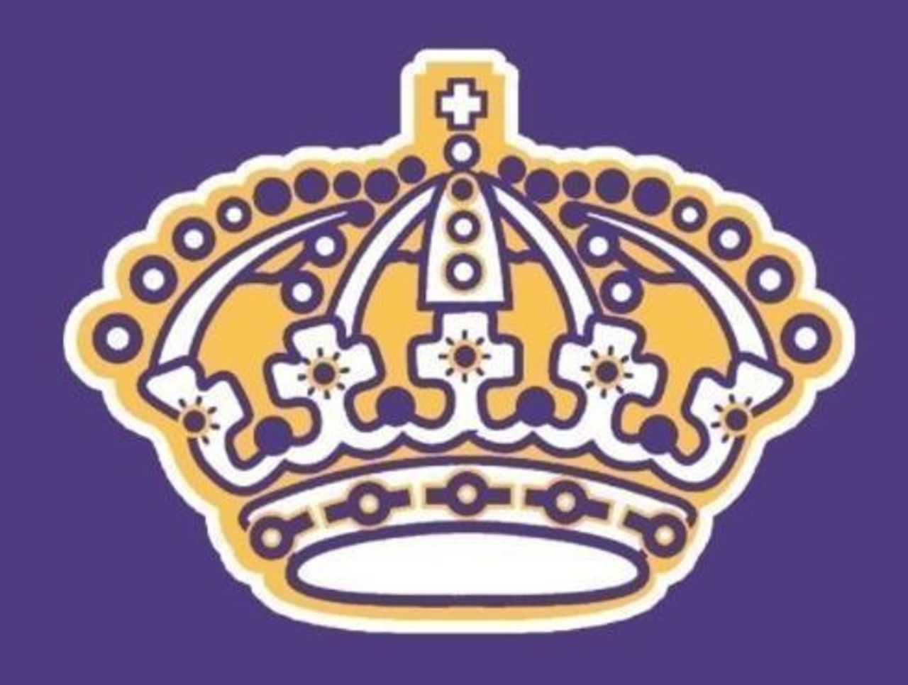
While the Kings' original and second logos - banners and all - draw universal praise, the bejeweled crown design on the team's purple road jerseys is impressive on its own. It's glitz and glamour befitting a Tinseltown team.
46. Pittsburgh Penguins (1968-1971)
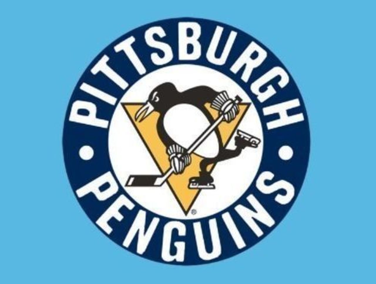
Nothing says late-1960s logo design like that lettering, which looks like it could have been used for the title screen of a sitcom. The Penguins realized the error of their ways a few years later, ditching the circle altogether.
45. Pittsburgh Penguins (1992-2002)
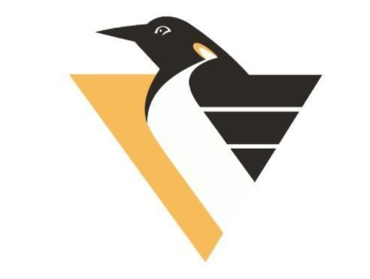
Coming off back-to-back Stanley Cup championships, the Penguins looked to shake things up, abandoning the penguin with a stick in favor of a more angular approach. The original penguin made its return a decade later.
44. Los Angeles Kings (1988-98)
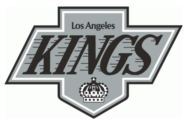
The Kings have been blessed with a handful of great logos - this one among them, even though the black, grey and white doesn't exactly pop off the screen. The speed lines on "KINGS" is a nice touch.
43. Buffalo Sabres (1996-2006)
This logo marked quite a departure for the Sabres, whose twin-sword-and-buffalo logo had been in place for the entire 26-year franchise history. We appreciate the effort, but we're glad they went back to the original.
42. Ottawa Senators (2011-present)
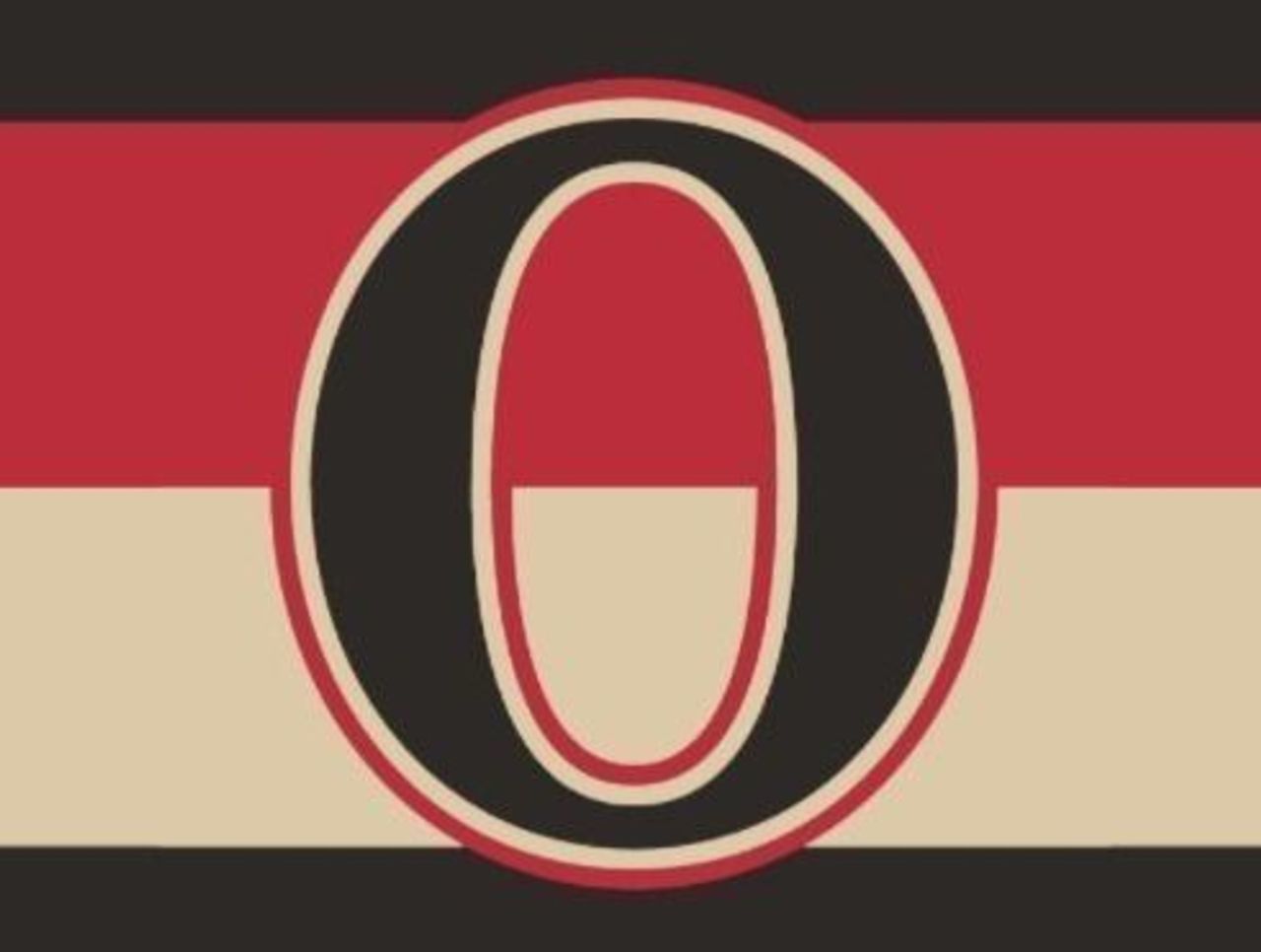
The simplest logos are often the best logos - and that couldn't be more true than in this case, with the Senators going with a classic "O" and an old-school color scheme that makes you feel like you're watching the 1920s version.
41. Columbus Blue Jackets (2010-present)
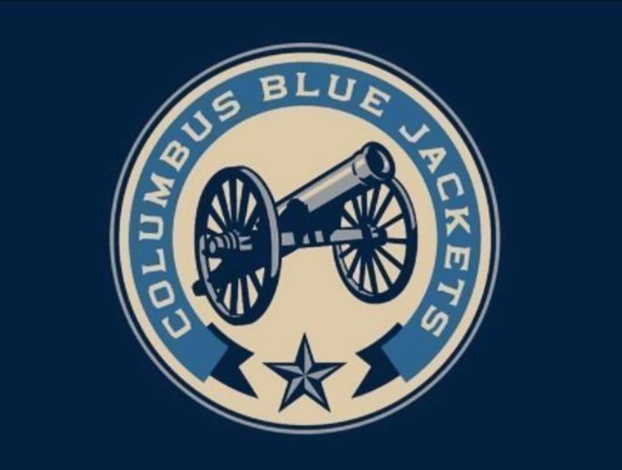
This is a great logo, even if the sight of munitions doesn't get you jazzed for a little shinny. Between the aesthetic color scheme, the understated font and that awesome cannon in the middle, this checks all the coolness boxes.
(NHL logos are used with permission and are courtesy of the National Hockey League.)