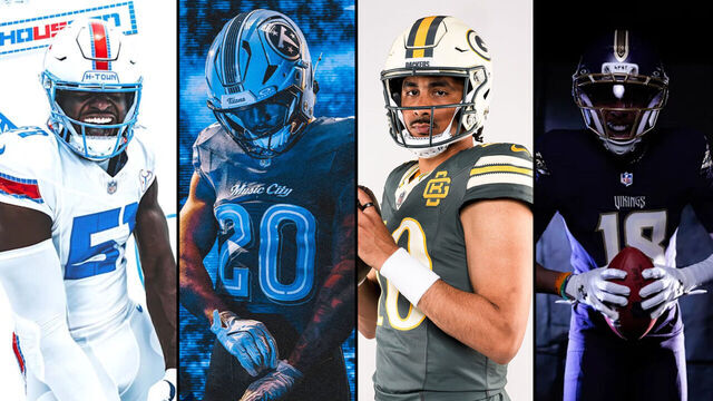
Eight NFL teams released their Rivalries uniforms Tuesday, adding to the league's new series of alternate looks.
The idea is similar to the NBA's City Edition and MLB's City Connect uniforms. Each NFL club is required to wear the new jerseys for one home contest against a divisional rival each season over a three-year stretch. The AFC West and NFC East (2027), and the AFC North and NFC South ('28), will join the program in the following years.
Here's how this year's Rivalries uniforms stack up.
8. Indianapolis Colts
The Colts' alternate jerseys will feature the team's horseshoe in their design for the first time, but that's one of few positives about Indianapolis' new look.
The Colts could've been more creative with their new color scheme and explored their classic blue and white better. The team's jersey includes black stripes that are hard to see given the uniform's predominant dark gray.
7. Jacksonville Jaguars
The Jaguars deserve credit for their attention to detail here; their alternate font and color arguably make the new jerseys better than Jacksonville's main uniforms.
However, we're still not sold on the teal helmet. Plus, the jaguar-inspired black-on-black spots on the pants appear tacky.
6. Houston Texans
If you had to double-check that those jerseys actually belong to the Texans, not the Tennessee Titans, you're not the only one.
The Texans came up with a bold idea to honor the city of Houston with several references to the state's largest city, and some new elements in their jerseys are solid. But the color scheme and overall design being so similar to a division rival's hurt Houston's final grade.
Here's a picture of the Titans wearing white before a preseason game weeks ago.
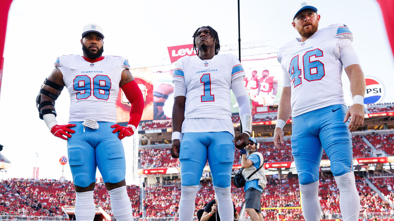
And now another look at the Texans' Rivalries jerseys. Not great.
5. Detroit Lions
This one's not a mistake, either - these alternate uniforms belong to the Lions, not the Carolina Panthers, but no one could fault you for thinking so.
Although Detroit's Rivalries design and color scheme look good, the team should've been more creative. The final product looks so much like the Panthers' main uniforms. It's hard to unsee.
4. Tennessee Titans
Tennessee got the job done with its Rivalries look, using navy and Titans blue as well as a great font choice for the numbers while honoring Nashville. The Titans should consider keeping some of those elements for their main uniforms in the future.
3. Chicago Bears
The Bears are bringing back their orange helmets, only this time it looks more natural in combination with the rest of their Rivalries uniform.
By keeping its traditional colors, Chicago maintains its identity with solid elements such as the striped socks and orange number inspired by a classic Bears era of the 1940s.
2. Green Bay Packers
The Packers' Rivalries uniforms feature a classic look with a great font and a nice cream helmet that goes well with the franchise's refreshed iconic green and gold.
The jersey collar probably could've been done better, but Green Bay's new alternates are great overall.
1. Minnesota Vikings
The Vikings adopted an all-purple alternate with key details in gold, adding incredible elements to their classic look and putting together this year's best Rivalries uniforms.
Minnesota's jerseys feature several references to the Viking Age, including "Skol" transcribed on the helmet in Rune characters and battle sword references on the pants and helmet. The braided stripes on the sleeves are also great.